Ōban Star Racers (Vol. 3)
Release: 2006 Studio: MRA Entertainment Region Code: 4 Format: DVD Type: Series
The Australian release of Ōban Star Racers seems somewhat hard to find, due to Ōban being not quite as well known (although it has grown somewhat of a cult following), and an older title from a discontinued distributor. It doesn't help that rather than a neat "Complete Season 1", it is instead broken up in volumes with a few episodes each. I did manage to find a copy of the third volume for cheap on ebay, and snatched it up. A new complete edition blu-ray is planned on releasing soon, but I still felt a curiosity for this older release.
Cover
Outside Cover
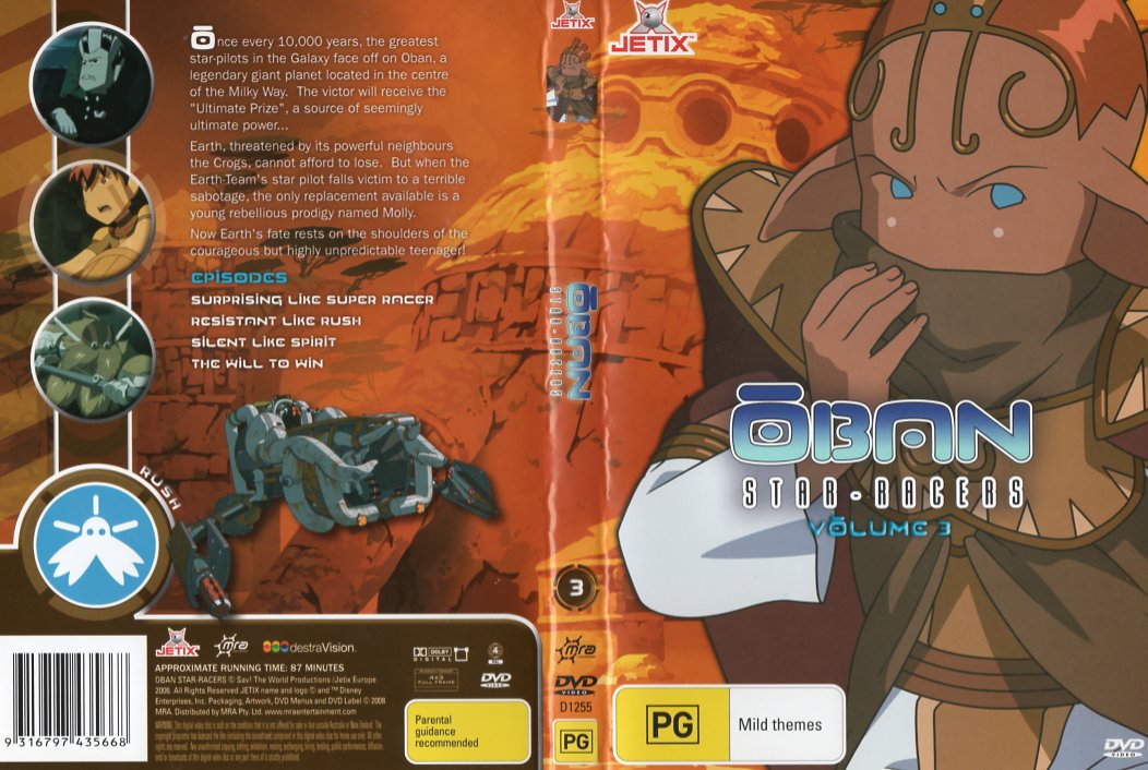
 The cover art is what peaked my interest enough to give this DVD a buy. It's simple, but it's eye-catching. The colour scheme of character on the cover, Aikka, blends in really nicely with the rest of the colour scheme of the DVD. Even his eyes match the coloured version of the Ōban title logo, adding a nice pop of a complimentary colour to the overall orange look. The "volume 3" subheading, while using the same typography as the title heading, looks a bit out of place, style-wise. I just think it would have looked nicer if it was a flat colour like the other titles, rather than adding a 3D effect on the letters.
I like that they keep to a connected-circle theme, seen here with the preview images. The preview "buttons" on the left side look quite nice.
The entirety of the outside cover shares one background. This makes the front, back, and spine seamless. While this gives you less to show creatively, I think it works quite well in keeping everything neat and together.
 Inside Cover
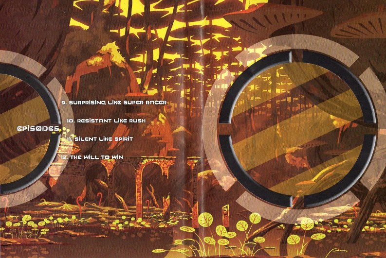
The inside cover has a beautiful Ōban background that keeps with the colour theming from the outside cover. On the left hand side there's an episode list ordered around a large circle, and to the right, another large circle matching the one near the episode listing. It looks a little odd as a scan, but this circle sits on the inside of the disc-holding space, and only visible when the disc is removed. It looks good when inside the case.
Cover Score: 4.5 / 5
Disc Art
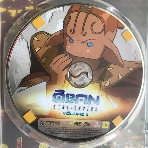
 The disc art, unfortunately, uses the same character art as the front cover. There is a different, metallic backdrop, possibly to tie in with the mechanical ships from the show? Irregardless, I don't really have many thoughts or feelings about this disc art. I wouldn't say it's one of the "lazy" discart designs, but it feels like less thought was put into the disc art in comparison to the cover.
The disc has a smooth satin finish.
Disc Score: 1 / 3
Case
Uses a common clear case, with the right amount of sturdiness when opening and closing. Uses the yinyang push button.
Case Score: 2 / 3
Menu
Main Menu
... Where am I? Did I put in the right disc? Huh, I guess I did.
Opening with the main menu, I'm instantly hit with a vibe that is more akin to some highschool shoujo anime rather than a fantasty action adventure racing anime. The colours are too pop and happy. The motion graphics themselves aren't too bad, except--except--for these god awful PNGs that zoom into your face, and pop out of view! Who OKed this?? It's even more offensive than the mis-genred background.
I do like that they continue with the connected-circle theme with the menu butons. The selection indicator is fine, but I think it would have been better if they highlighted the boarder rather than have a solid transparent colour fill in the whole thing, washing out the text a little.
The menu is accompanied by the OP song, with sound effects from the anime and everything.
Episode Select Menu
Now this menu is a little better. Still has that very bright coloured pop theme, but now the background music is an intrumental version of the OP song, I believe, which is a nicer choice. Most of this screen is static, except for the preview images which are animated clips. Moly keeps the visuals interesting while not being too invasive to the eyes, and the previews are still keeping to the connect-circle theme. Although, I've noticed that the selection overlay does not fit perfectly in these circles, and is instead too small by a few pixels. It's a small detail, but it bothers me a bit.
Overall, the main menu is.. not great, but there's at least some effort put into it, and the episode menu is decent. One extra thing about the menu however, is that once the song is finished for the main or episode selection menu, the disc will start playing automatically. I guess that could be nice to avoid having the menu play for an hour when you fall asleep at your slumber party, but for me I find this to be annoying. I might still be getting some tea and snacks or something and wouldn't want the disc to start without me.
Menu Score: 2 / 5
Features
Pre-Menu Video
30 seconds of warnings and logos, one logo for Jetix and the other for MRA. These are skippable by pushing the "top menu" button.
Other
There are no subtitles, and it only comes in english dub. Includes no other features.
Final Thoughts
The cover and the case are good, but unfortunately, the further you go the more disappointing this release becomes. Thankfully we have the blu-ray version to look forward to, at least when it comes to features, like available languages, subtitles, and bonus features. Hopefully it will improve upon this older release in terms of physical media art and menus as well.
OVERALL SCORE: 5 / 10
Hosted by NeoCities. Created 2023.
